How to build a "sticky footer" for your WebApp | CSS Height & Positioning
January 29, 2023 - 5min - #css #height #positioning #stickyfooter #webdev
So, you want to build a footer that stays at the bottom of your screen or lower, depending on the main content size? Well, in the process, CSS height might confuse your deepest beliefs about reality! It's a common webdeveloper joke, that CSS height is the hardest part of programming. But fear not, you will likely find your solution in this article.
Table of Contents
1. Common Attempts & Solution
Ok, first of all, let's assume your situation is similar to this basic html structure:
<Html>
  <body>
    <div aria-label="Main Layout">
      <header></header>
      <main></main>
      <footer></footer>
    </div>
  </body>
</Html>
What does not work (Common Attempts):
<main className="h-screen">(height: 100vh)<main>is now as high, as the screen which means it pushes the footer out of the viewport
<main className="h-full">(height: 100%)- nothing happens: the parent elements limit
main(child) to the size of its contents, via their defaulth-auto(height: auto) - if you set all parents to
h-full, you get the same "push-out" problem as withh-screen
- nothing happens: the parent elements limit
What does work (Solution):
<Html>
  <body>
    // min-height: 100dvh; display: flex; flex-direction: column;
    <div className="flex min-h-dvh flex-col">
      <header></header>
      // flex-grow: 1;
      <main className="grow"></main>
      <footer></footer>
    </div>
  </body>
</Html>
min-h-dvh sets the minimum height of the container (parent of main).
Instead of using min-h-screen (min-height: 100vh) we use "dvh - dynamic
viewport height" to ensure mobile-screens substract the browserbar from the
screen-height, which would otherwise push out the footer aswell.
flex flex-col sets the container to be a flexbox in column direction. (You
want header, main, footer to be stacked ontop of, not besides each other.)
And grow sets <main> to fill out as much of the free space in the parent
flexbox container as possible. <header> and <footer> should not have grow
in this case, or they compete for the space.
2. CSS Debugging Strategies
If the above solution did not fit your situtation, or if you are curious on how to faster find solutions by yourself, I'll show you 2 approaches that helped me a lot: The Multifile Overview and the Blank Slate.
The Multifile Overview
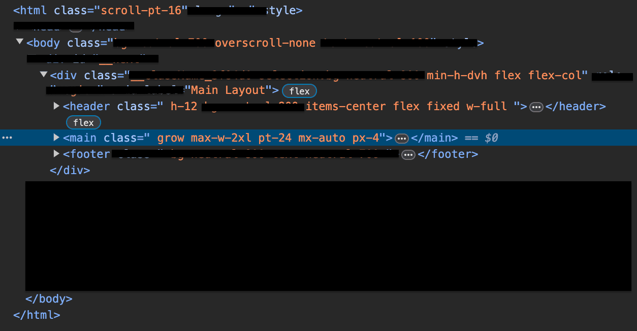
This might be basic to many, but sometimes all you need is a focused overview about all hmtl tags and classes involved, which are spread over different files. The fastest way I found is to:
- open dev tools element view as wide as possible,
- open just enough parents to reveal only the tags that are relevant to your situation,
- screenshot that overview,
- and cross out all left over distractions with your screenshot/ image tool.
- for example leave only classes related to height and positioning
This takes 2 minutes and helps you to get clear of the css relationships even after long sessions of confusing trial and error:

Of course you can type that out instead or just cross out in your mind while looking at the devtools.
If you have a big enough screen, also make sure to open all component files besides each other (multiple split editors), in parent to child order.
The Blank Slate
Another great way for clarity is to just build everything from scratch... almost. Of course you can keep everything that you've built. It's just about experimenting on a clean slate in a different branch, where no overlooked CSS can interfere.
Just git add . git commit your current branch and
git checkout -b blank-slate. Then delete everything except for the basic html
structure from above including all css-classes.
Of course you don't have to spend all that time deleting all classes of all
components: (In NextJS,) it is enough to delete the Layout component tags in
_app.js, any classes in _document.js, and then make a copy of index.js
that returns:
export default function Home({}) {
  return (
    <div aria-label="Main Layout" className="">
      <header className=""></header>
      <main className=""></main>
      <footer className=""></footer>
    </div>
  );
}
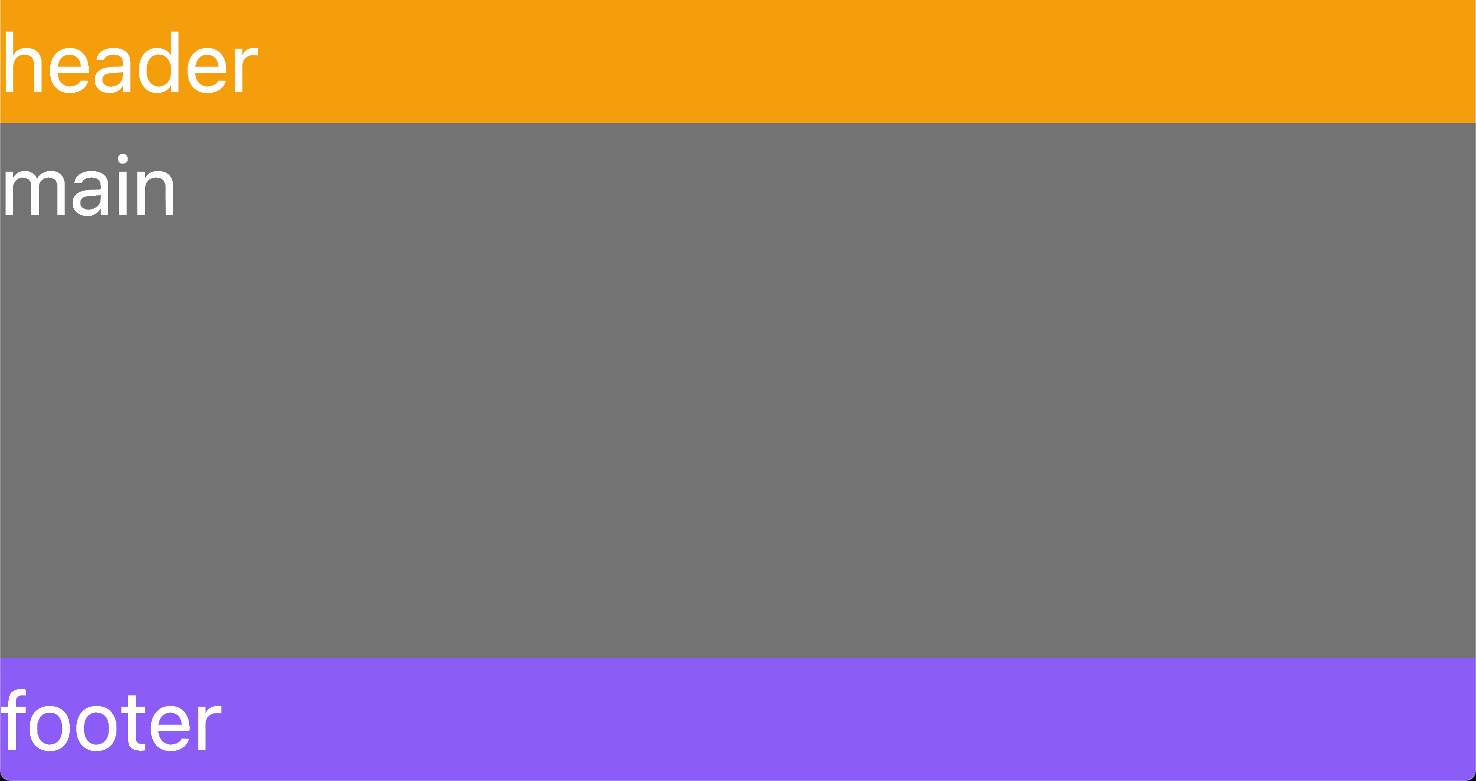
This way you can edit 4 components in a single file for fast prototyping and land quickly at insights that you can then transfer to your actual branch. After a few steps from scratch it might just look like this:

3. Alternative: Try Grid
If all the previous assistance still wasn't enough, you can also use CSS-Grid. It is a bit unconventional though, because to make it sticky, you would have to nest your footer inside of your main, which could be confusing for screenreaders and SEO.
On the other hand, grid seems to be fun working with! Just see for yourself in this article by css-tricks.com:
css-tricks.com: How To Use Css Grid For Sticky Headers And Footers
But before you go... subscribe below:)